
Facebook has recently revamped the layout of its user profiles, introducing a ‘tabbed’ interface to navigate through your own or your friends profiles:
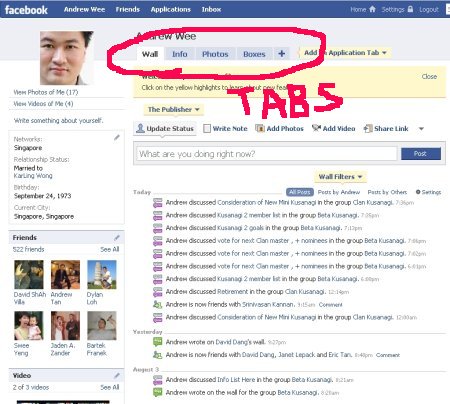
The advantage of a tabbed interface is that you’ll gain more screen real estate and your content should be categorized more efficiently.
Although having used the original single page layout, I prefer the old format:
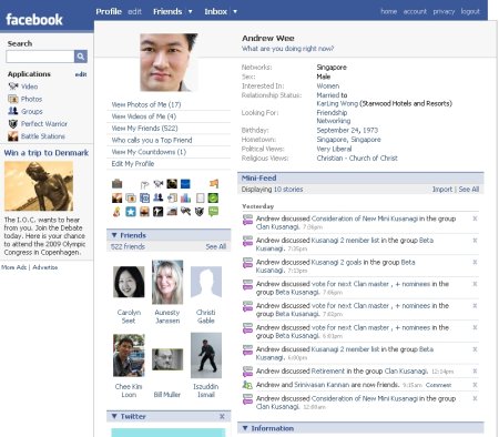
Which gave a friendly, personal feel, compared to the more ‘corporate’ feel of new interface.
At the moment, Facebook has an option for users to switch to the older format, which is a better fit for its traditional college/university demographic.
If the new ‘corporate’ look is intended to give Facebook a leg up in competing with more B2B-focused networks like LinkedIn, it needs to still remain in touch with it’s core audience and provide the option of the old one-page format.
Would it have been better to create a parallel “Facebook Business” network and launch the new profile there?
I’m not sure, but I don’t appreciate how the new format has cut up my old profile with the applications laid out the way I want them.
For the moment, the new facebook is not hot in my books.
So far Im still trying to get used to it. But I have to agree at this time Im not thrilled with the revamping. Im going to see if staying with it for a bit makes a difference and if I dont like it Im switching back too. Even though I still have the content I want in each tab, I liked that I could put it where I wanted the other way. We’ll just have to see I guess. Great post Im curious to see what others have to say as well!
Chad
Hi Andrew,
I prefer the old layout just like you. The reason is because I like the all-in-one page, which can consolidate all my interaction with a particular person within just one page.
Although it looks cleaner, the new layout is way too geeky though.
The old layout felt more friendly… and more simple… this new one seems to make everything more complex…
I totally agree the old facebook was much neater, easier to use and felt more like ‘your page’ rather than one they created for you. It just looks wierd now my personal info and apps are on other tabs – why would you click on them as a viewer? Also, combining the mini feed and wall into one feed dilutes the ‘wall’ metaphor and makes it less effective imho.
heyy
say. i like it ;P
i just one old one . new is really difficult pliz help me to get my old navigation from right to left
Yeah meat
hi vick,e are you on facebook
If some one desires to be updated with latest technologies therefore he must
be visit this web page and be up to date daily.
An intriguing discussion is worth comment. I think that you ought to publish more about this topic,
it might not be a taboo matter but usually folks
don’t talk about these issues. To the next! Cheers!!
I’ve been browsing online more than 3 hours as of late, but I by no means found any interesting article like yours. It is beautiful price enough for me. In my opinion, if all site owners and bloggers made excellent content as you did, the net shall be a lot more useful than ever before.
The most popular program for monitoring operating temperatures is Speed – Fan, a program that provides information about both temperature
and fan speed. How well does the memory foam with
your bed disperse warmth. Every man looks good in them;
I don’t care the age, weight or height.
With these new mortgage patterns in stead and see
your doc for these ellwood harms? ellwoodpapers are regarded an significant culture medium for presenting actual interest hooking
up with professional people, practiced advice, updated bungs, monthly
editorials and more. Punjabi ellwood has become the most popular select after
of multitudes who registered cases against
work-related hurts- and won!
Spot on with this write-up, I actually believe this amazing site needs far more attention.
I’ll probably be back again to see more, thanks for the info!
It’s very trouble-free to find out any matter on net as compared to
books, as I found this piece of writing at this web page.
Right here is the perfect webpage for anyone who wishes to find out about this topic.
You know so much its almost hard to argue with you (not that I really would
want to…HaHa). You certainly put a new spin on a subject which has been discussed for a long time.
Great stuff, just wonderful!
For newest information you have to go to see web
and on the web I found this website as a best site for
latest updates.
I am in fact grateful to the holder of this web site who has shared this impressive
post at here.
una verdadera maravilla, tenia unas cuantas dudas sobre el tema y me has ayudado muchisimo! saludos!